Excerpts from "The Palestinian Poster" by Dr. Shafiq Radwan (1992)
The Arab press played an important and varied role in the development of political graphic art, which included the poster. For the Palestinian people, who lacked national independence and lived under oppressive conditions within and outside of the occupied state, “not a single Palestinian organization published a newspaper openly expressing its point of view. Rather, these organizations relied on secret pamphlets and internal newsletters to express themselves” (87/285).
This changed in the late fifties and early sixties. With the development of the Palestinian national liberation movement, a number of Palestinian newspapers of limited distribution appeared. However circumstances still prevented them from contributing meaningfully to the development of journalistic graphic art.
Paralleling the Arab “social posters,” which had employed silkscreen techniques earlier in the mid 20th century, a novel form of health education poster appeared in the Palestinian context. The department of hearing and visual aid at the headquarters for Palestinian Refugee Relief in Beirut established around 1952/1953 commissioned these posters. The first of these were likely illustrated and printed manually on silkscreen by Jamil Shammout (b. 1932) in 1955. While “the posters of Jamil are distinguished by their abundance of details,” the educational posters of Ismail Shammout, published by the same department between 1956 and 1958, according the artist himself, tended to be more streamlined, eschewing details yet still possessing expressive value. The artist used simple harmonious colors compatible with silkscreen printing (96).
These features of (Ismail) Shammout’s work are clearer in his first political posters, released in 1965 by the Palestine Liberation Organization’s department of Art Education, which the artist himself headed from 1964 to the present (1992).
Despite their historical importance as the first political posters published by the PLO, we lack pictures of these posters and thus must base our study on Shammout’s drafts, his descriptions of their contents and execution in a letter to the author, and finally on their similarity to the existing PLO materials which clearly drew their artistic inspiration from the current logo, also designed by the artist.
With the birth of the Palestinian Liberation Organization in 1963 as a legitimate representative of the Palestinian people, Palestinian visual art which was used in media, publicity, and in galvanizing the Palestinian people was given the enormously important mission of determining and introducing the organization’s goals, slogans, and symbols. This required creating novel forms of visual incitement. Chief among these was the political poster.
[In 1965] The PLO released the first of its poster collections, which contained four posters, distinguished by their simplicity of idea and design and each carrying the organization’s logo. We can look to the words of the artist himself to describe the function of his first poster:
http://www.palestineposterproject.org/poster/we-are-all-for-the-resistance
“With this poster, I wanted to introduce [the PLO] logo, and at the same time convey the idea that the Palestinian people are the pillars of this organization.” The artist portrayed the necessity of a unified Palestinian people and its relationship to the nascent liberation movement. The form of a Greek temple with a gabled roof adorned with the recently released PLO slogan was supported by a number of people standing upright like columns. In their varied appearances, they seem to represent different social classes. Affirming this central meaning, the slogan: “All of us are sons of Palestine” is written below. A version of this poster released after 1967 modified this slogan to read: “we are all for the resistance.”
Curator’s Note: The version of the poster on display at the PPPA is the later, 1967 version. From the above text it appears that the imagery is exactly the same and only the text/slogan was changed. DJW
The flatter style of this poster was in accordance with features of classical Arabic figural art as well as with the reigning concepts of contemporary design and visual clarity. Its cartographic legibility lessens the emotional charge carried by the poster a theme reiterated in the other posters from this collection.
Amidst the participation of the Arab states in the PLO’s establishment and the need to highlight Arab solidarity, the artist presented his second poster, a symbolic and ornamental work executed in a style similar to the Reclama.
The PLO’s logo occupies the poster’s large central space and was surrounded by ribbons depicting, somewhat traditionally, the flags of the Arab countries.
http://www.palestineposterproject.org/poster/palestine-liberation-organization-first-logo
Using the logo as the basis for the poster’s construction was a technique employed later in a number of posters by factions of the Palestinian resistance to commemorate special occasions.
For the PLO logo, Ismail Shammout used a simple design containing national symbols that would have been familiar to viewers. The image includes a shield encompassed by another larger shield. Reminiscent of a number of his graphic techniques, the artist arranged the illustrated components of the work to intersect with one another. A horizontal hand holds a Palestinian flag. Beneath the flag is the map of Palestine, while above it sits a torch, an image used often by the artist in this period and one that symbolized freedom and revolution. Written lines form symmetrical arcs around the image.
http://www.palestineposterproject.org/poster/palestine-liberation-organization-first-logo
The intersections between the internal components reflects a sort of static balance. Underscoring the logo’s immense success, it served as the basis for the logos of a number of Palestinian resistance factions, who adapted it for their purposes with additions, deletions, and other modifications.
The announcement of the armed struggle by the Palestinian National Liberation Movement (Fatah) in 1965 necessitated new symbols and graphic possibilities. Unlike the static form of the PLO logo, the logo of Fatah armed resistance (al 'Assifa), designed by the Syrian artist Naim Ismail, was characterized by a violent dynamism, a result of the tension between the various components of the image with the external border as well as the intersection formed by two arms forcefully holding up guns, slanting towards a map of the country.
http://www.palestineposterproject.org/poster/al-asifa-logo-green
One also cannot fail to notice the harmonious movement between the written text and the accompanying symbols: a map of Palestine and a hand grenade. Just as the intersection of weapons enhances the meaning of the text, the relatively numerous details enrich the content and increase the popular appeal of this logo.
In a style similar to his artistic treatment of the health education posters, Ismail Shammout devoted the third of his four original PLO posters to the topic of financial collection for the Palestinian national fund. The poster contained a hand dropping money into a collection box that bears the slogan of the PLO.
http://www.palestineposterproject.org/poster/for-palestine
Compensating for his documentary, descriptive treatment, lacking in figurative imagery, is the slogan: “pay a piaster, reclaim an acre.” This slogan can be distinguished from the famous slogan used by the Zionist movement in its financial collection that read: “Pay a dollar, kill an Arab.” For us, this poster’s value stems more from its historical and moral significance than from its artistic merit. However, despite this importance, it is worth noting the lack of attention paid to this topic in Palestinian posters throughout the years of revolution.
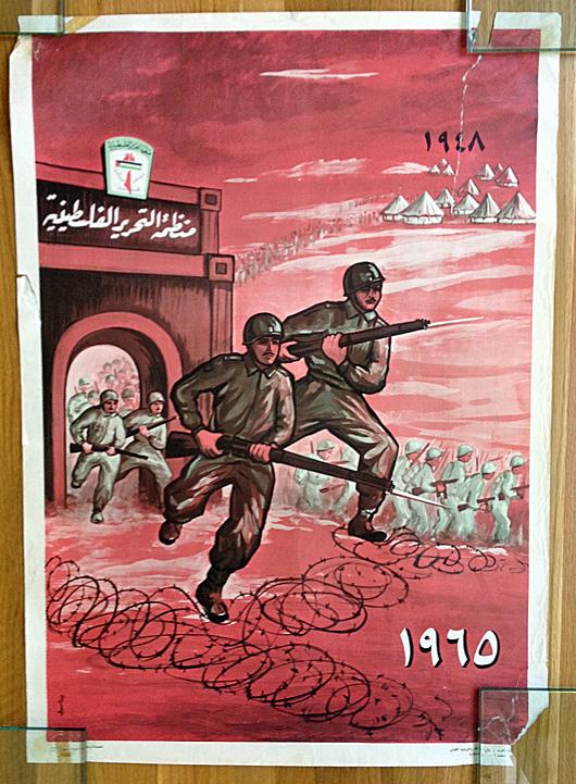
Differing from Ismail Shammout’s ambitions toward a symbolic treatment of the subject matter, his brother Jamil Shammout strove, in the last of the aforementioned posters issued by the organization, to evince a more narrative graphic style. The image depicts armed masses of refugees bursting out of their camps and crossing a security gate that is decorated with the logo of the Palestinian Liberation Organization. The gate appears isolated in the landscape like an “arc de triomphe.” In the noticeable movement of the masses towards the edge of the page, the meaning of the poster and the increasingly important role of the PLO in leading the Palestinian people’s struggle to return becomes clear.
http://www.palestineposterproject.org/poster/1948-1965
Additionally, Palestinian visual media between the establishment of the PLO in 1964 and the beginning of the active armed struggle in 1967 included a limited number of posters circulated under the nationalist revival to honor the movement’s leaders who had been martyred. In addition to their historic value in terms of the development of the poster, these photographic posters consecrating the memory of martyrs like Sheikh Izz al Din al Qassam, the leader of the revolution of 1936, and Abd al Qadir al Husayni, the leader of the battle for control of Qastal Hill (Operation Nachshon) also contained a great deal of moral value for the masses.
Ali Al Khatib’s poster, published in the year 1965, also holds significant historical value both in terms of its content, which announced the armed struggle after years of organizational work and psychological preparation, as well as for its artistic style. In this work, the artist endeavoured to reconcile Arab artistic traditions with foreign ones. In a general artistic style, the artist used a large font to highlight the text of the first known military communique for the “stormtroopers.” An open scroll that seems hastily written faces directly toward the viewer, occupying the majority of the page save for the upper margin where we find the expression: “the Palestinian National Liberation Movement Fatah.”
In addition to the poster’s media and publicity value, its artistic execution fittingly connects the rich art of calligraphy in Classical Arabic heritage with the meanings of the sacred struggle. He brings to memory the reverence for inscriptions in the culture and the lofty meanings they hold. Meanwhile, his minimal use of artistic tools conveys the severity and steadfastness of his position.