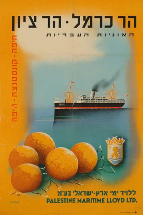
Hebrew translation:
(large black text at top)
Har Carmel - Har Zion
(the names of two separate ships)
(small black text)
The Hebrew ships
(small red text down left side)
Haifa - Constanza - Haifa
___________________________________________
An English-language version of this poster may be viewed here
___________________________________________
In the early 1930s, several privately held Palestinian Jewish corporations were founded that transported passengers and goods from Jaffa and Haifa to ports in Egypt, Syria, and Cyprus. Our first poster is an advertisement for the ships Har Carmel and Har Zion (Mount Carmel and Mount Zion) (Figure 1), which were combined passenger and cargo ships belonging to Palestine Maritime Lloyd Ltd.17 It was designed by Oskar Lachs, whose work, like that of many German graphic artists and photographers in the interwar period, was influenced by the style of Soviet propaganda materials and French turn-of-the-century posters.18
The purpose of this poster is to present an image, and its ideological message is more important than its function as a commercial tool aimed at a specific target audience in a competitive market. Two components of the poster’s design – the way the eye is led along visual paths,19 and the merging of visual and verbal icons symbolizing entire worlds of content – turn this poster into an image-forming mechanism that addresses both local and international audiences. The poster can be seen as a statement about the historic significance of independent trade realized by means of “Hebrew ships,” which not only carry inbound tourists but also export the local citrus fruit, and about the call for international recognition of this trade. It constitutes both a national statement and a celebration of an enterprise receiving international acclaim. In connection with Palestine Maritime Lloyd, it symbolizes the economic initiative of an entity that is not yet an independent state but is nevertheless conversant in the ways of the economic world and cultivates the national-economic enterprise of exporting the locally grown citrus fruit.20 The poster declares: we are already an active economic entity (economic activity being one of the criteria for sovereignty), for we are merchants-exporters – all this while elegantly avoiding the fundamental question of who “we” refers to in this sensitive pre-state era.
The viewer’s eyes are first guided to the oranges in the foreground by their vivid color. They are visually linked to the name of the shipping company and its familiar logo, and to the frame of the poster, and only later is the viewer’s eye drawn inwards, to the small image of the ship in the poster’s center. The fruit’s orange color not only forms a harmonious combination with its complementary color, blue, but also resonates with the blue (and with the absent, but present in the Jewish addressees’ mind, white) to form national “color stripes.” The Lloyd logo, the ship, and the national colors are welded into a unified and clear symbol of a local entity that is presented as being on a par with an international entity (the current rulers of Palestine).
The visual packaging evokes international graphic styles, familiar, for example, from Soviet propaganda posters of the 1920s. The elements of the poster are commercial, but its overall conception is perceived as national-ideological. The oranges, one of the most prominent symbols of the (economic and symbolic) bond between the Jewish diaspora and the reemerging Jewish community in Palestine, are associated here with the Haifa – Constantza–Haifa shipping line (in the wording along the left edge of the poster).
This advertisement, like texts belonging to other “light” and “marginal” genres such as popular songs or feature films, was thus harnessed to serve the Zionist nationalist agenda. With its openly propagandist character, conveyed through the accepted graphic and chromatic conventions of the era, it is immediately understood as a tourist advertisement aimed at selling a product, yet, at the same time, it is utilized to convey ideological messages. The poster addresses local and external audiences simul- taneously: Yishuv Jews intending to travel abroad, foreign tourists coming to Palestine, and also Jews everywhere, local or foreign, who do not necessarily intend to travel but would take pride in witnessing the very existence of “Hebrew ships.” The adjective
“Hebrew,” which evokes the ancient identity of the Jews before they became a people, was already associated with the national enterprise of reviving the Hebrew tongue. The nation is thus defined by its language. For the Jewish audience this is a nationalist text, both on the overt level and the covert ideological one. The propagandist format helps to soften and sublimate the political message.
Source:
Tourism Posters in the Yishuv Era: Between Zionist Ideology and Commercial Language
By: Ayelet Kohn and Kobi Cohen-Hattab
ISSN: 1353-1042 (Print) 1744-0548 (Online) Journal homepage: http://www.tandfonline.com/loi/fjih20
Begin forwarded message: From: Jonathan Rose Date: May 30, 2010 5:26:00 PM EDT To: Dan Walsh Subject: Re: Hi Jon...two items... Hey Dan, 1) Sorry about not sending the URL. I think that was only one poster, but if there are more, please tell me and I will resend them with URL. 2) Interestingly, that poster says "Eretz Yisrael" in Hebrew, not Palestine. I hope things are going well with the collection. Best, Jon On Sun, May 30, 2010 at 5:19 PM, Dan Walsh wrote: 1) Whenever you send me a translation please always include the URL. Without it I have to scan through hundreds of posters to find the right one. 2) http://www.palestineposterproject.org/poster/the-hebrew-ships In the translation below you say that the Hebrew text says "Maritime Israeli Lloyd LTD" The English text says "Maritime Palestine Lloyd" Does it say BOTH? Great work...I am very happy with the way things are working out. Enjoy your summer! Dan On May 26, 2010, at 10:39 PM, Jonathan Rose wrote: Postersimage 48 Top: Mount Carmel * Mount Zion The Hebrew ships Left vertical: Haifa – Konstantsa – Haifa Bottom: Maritime Israeli Lloyd LTD
Begin forwarded message: From: Jonathan Rose Date: May 26, 2010 10:39:58 PM EDT To: Dan Walsh Subject: Poster Postersimage 48 Top: Mount Carmel * Mount Zion The Hebrew ships Left vertical: Haifa – Konstantsa – Haifa